Design Styles I Would Love to Work On
Too many modern SaaS websites look like carbon copies of each other: purple gradients, pill badges, and generic vector icons. Here are the distinct aesthetic territories and design languages that I am deeply passionate about exploring in future projects.
1. Tactical Editorial & Swiss Modernism
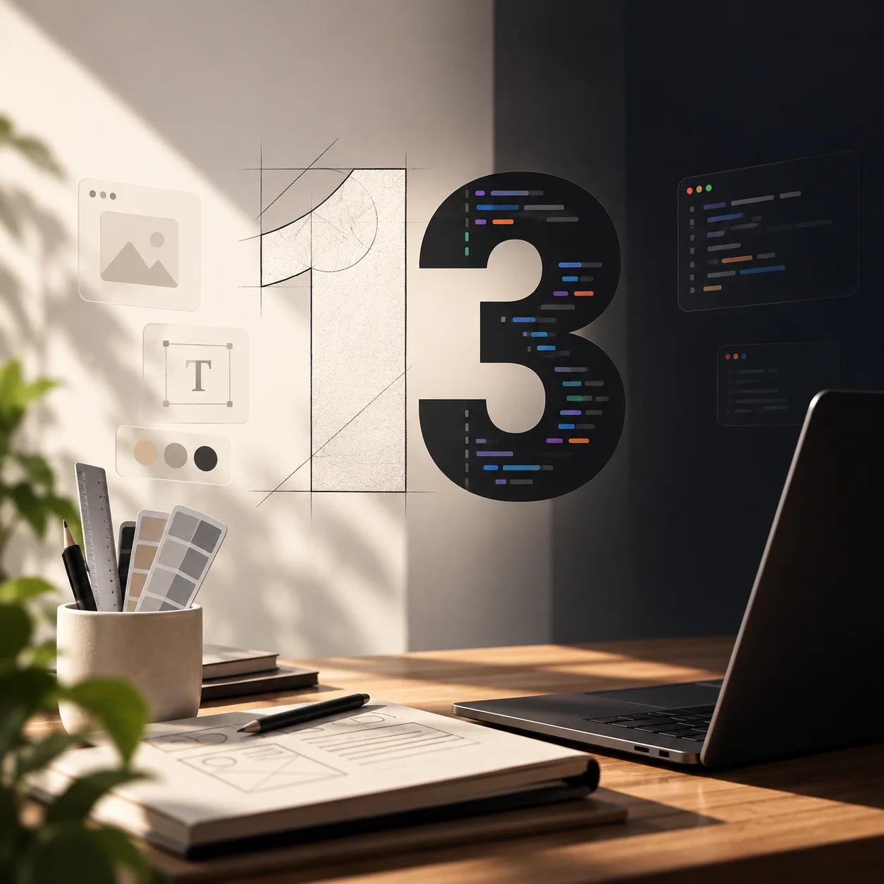
Inspired by classic Swiss print posters, editorial magazines, and architectural blueprints. This style relies on strict visible 1px grid guides, sharp monospaced annotations, intentional negative space, and disciplined typography pairings (like Mona Sans + Archivo). It feels deliberate, timeless, and intellectual.
2. Tactile Analog & Physical Hardware Skeuomorphism
Not the glossy 2011 iOS skeuomorphism, but the high-end tactile feel of Teenage Engineering synthesizers, Braun audio gear, and Leica cameras. Think matte finishes, subtle embossed dials, illuminated LED toggles, satisfying spring resistance, and micro-haptics that make digital tools feel physical.
3. Hyper-Dense Telemetry & Bloomberg-Style HUDs
Interfaces designed for power users who crave high information density without visual clutter. Fast keyboard-driven command palettes, monospace financial charts, real-time telemetry streams, and zero wasted whitespace. Building tools that feel like the cockpit of a fighter jet or a precision trading desk.
4. Retro-Futuristic Cyber-Minimalism
A fusion of 80s sci-fi interfaces (think Alien, Blade Runner, and early industrial CAD terminals) translated into modern web standards. Subtle CRT phosphor glow, geometric ASCII borders, crisp monochrome high-contrast palettes, and instant zero-latency transitions.
The most exciting design lives at the intersection of analog nostalgia and precision digital engineering.
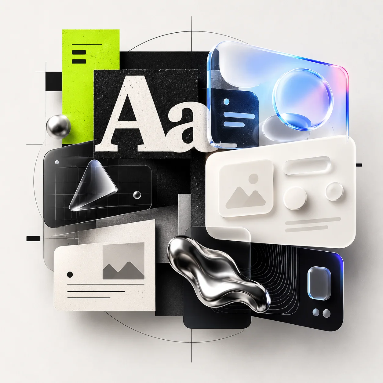
5. Spatial Refraction & Glassmorphism 2.0
Moving past simple CSS backdrop-blur filters into real light physics: chromatic aberration on card borders, realistic caustic reflections, depth layering, and subtle surface micro-scratches that react to cursor light sources.